The Moon On The Tin: Designing NOOKS
How a French shoe polish tin, months of wrong turns, and one judgmental moon became the face of a balm.
TL;DR
NOOKS packaging was inspired by Crème Éclipse, a 19th-century French shoe polish tin. What followed were months of exploration. Homely balm lockups. Seventies nostalgia. Apothecary warmth. Industrial irony.
The truth arrived immediately. And I ignored it.
The very first labels were printed on thermal postage paper. White. Black ink. Never intended as design.
I didn't recognise the answer until the moon's face became the hero. And white revealed itself as the only canvas that could hold her.
Sometimes the work shows up early. It just waits for you to catch up.
The Moon On The Tin
Where Relics Come From
The man in the moon wasn't the plan. He was the accident that made everything make sense.
The Tin That Started It
Crème Éclipse.

A French shoe polish tin from the late 1800s, found deep in an antique image search at an ungodly hour. Not skincare. Not a competitor. A relic from a time when products weren't designed to be photographed. They were designed to exist.
The eclipse motif. The moon's face, half in shadow. An expression that's hard to name.
Not friendly. Not unfriendly. Just knowing.
Like he's already seen what you're about to do and has opinions.
That face. That attitude. That was it.
NOOKS didn't need a logo. It needed a character.
Personification as Practice
Giving products a personality isn't new for me. It's how I work.
At Lick, the voice came first. Every product had an attitude before it had a colour name. The brand spoke like a person because it made decisions easier. Would she say this? Would she do that?
Strategy through character.

NOOKS needed the same discipline. But this time, the character arrived visually first. The moon showed up before the voice did.
Once I saw her face, I knew how she'd speak.
Cold. Knowing. A little superior.

Watching from above with the calm of someone who has seen it all and isn't rushing to see more.
The tone wasn't invented. It was inherited.
From a tin of French shoe polish made before my grandmother was born.
The Homely Balm Instinct
Early versions leaned into what balms are supposed to look like.
Traditional lockups. Heritage typography. Dense labels. Text everywhere.

The visual language of "we've been doing this forever."
It made sense. Balms have rules. Consumers recognise them. Why fight it?
Because the more homely it became, the more NOOKS disappeared.
Another heritage balm. Another safe decision. Another product you forget five minutes after closing the tab.
Fine wasn't the goal.
The First Labels (That I Didn't See)
The first tins arrived blank.
No labels. No decisions. Just aluminium.
I needed to see something on them. Anything. So I printed test labels on a thermal printer. The kind used for shipping. White paper. Black ink. No layout thinking. No colour theory. No intention.

I never once thought this was the solution.
I stuck them on purely to answer practical questions. Where does the face sit? How much space does it need?
And there it was.
Plain. Bright. Unavoidable.
The moon's face wasn't receding into darkness. She was exposed. Present. Watching.
But I didn't trust it.
At the time, I was still trying to design. Still searching for something smarter. More considered. More "premium." I assumed the answer would arrive later, properly dressed.
So I moved on.
Months of Getting It Wrong
For months, I worked around that first instinct.
I tested white on black. I tested colour. I tested warmth, cleverness, nostalgia.


Terracotta. Seventies retro. Pink and green. Coral and olive. Every tasteful neutral that behaves well on a moodboard.
Even an industrial petrol-can concept. A literal nod to "no petroleum." Clever in theory. Absurd in reality. Killed immediately.
Dozens of mockups. Boxes. Tins. Hands. Shelves. Skin tones. Warm light. Cool light.
Flat files lie. Objects don't.
September. October. November. December. Versions multiplying instead of resolving.


Eclipse to Moon
Early attempts honoured Crème Éclipse too literally. Half-shadow. Crescents. Stars. Decoration doing unnecessary work.
Then the obvious hit.
The tin is circular. The moon is circular. Stop fighting it.
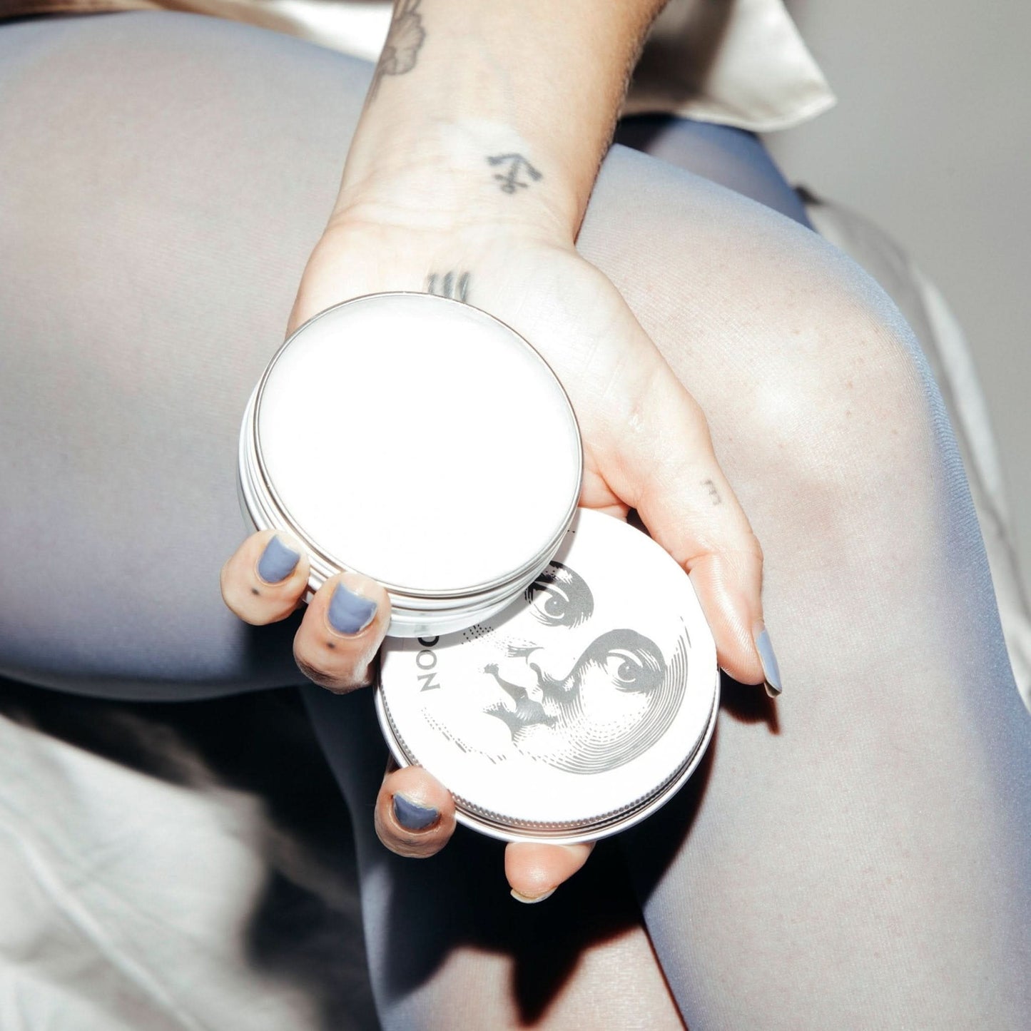
The original moon was eclipsed. The NOOKS moon is full.


Unobscured. Direct. Looking straight at you.
Once she took over the entire tin, everything changed.
She wasn't an element anymore. She was the product.
When the Obvious Became Inevitable
It wasn't until the eclipse disappeared that the truth surfaced.
Once the moon's face became the hero, everything else fell away.
And suddenly, white wasn't a backdrop. It was the only canvas that made sense.

White gave the moon contrast. White gave her presence. White let detail speak without mood or theatrics getting in the way.
The thermal label wasn't crude. It was correct.
I just hadn't earned the confidence to accept it yet.
The Inversion
Premium usually means dark.
Black packaging. Gold accents. Serious. Mysterious. Heavy.
Black on white did something else.
It was lighter. Sharper. More confident.
The moon didn't hide in shadow. She stared straight back.
Not black tin, white moon. White tin, black moon.
The inversion didn't add meaning. It revealed it.

When It Clicked
The shift wasn't discovering something new.
It was finally believing what was already there.
The moon didn't evolve. I did.
Relic, Not Trend
The goal was an object that felt found, not launched.
Something that could sit beside your grandmother's compact and feel inevitable.
Trends age fast. The moon doesn't.
That's the point.
Genderless by Design
Black and white doesn't market bodies.
No pinks. No greys. No codes.
The moon doesn't have a gender. Neither does skin in need of care.
One product. One face. Every bathroom. Every tool box.

From Tin to Tone to World
The moon started as packaging. She became the brand.
Once the visual locked, everything followed.
If the moon is on the tin, how does she speak? How does she light a photograph? What world does she belong to?
The copy doesn't persuade. It states.
The photography follows one rule: Shoot it like the moon is the last light left on Earth.
High contrast. Cool tones. Shadows doing half the work. No wellness glow. No golden hour.
Lunar light only.
One product. One face. One world.

The Process
Inspiration Crème Éclipse, Société Générale des Cirages Français, circa 1890s
Gut instincts Apothecary cream or lunar black and white
First direction Traditional balm lockups. Dense. Forgettable.
Directions tested 70s retro, terracotta, coral, sage, industrial, petrol-can, and 50+ others
Mockups Everything. Had to see it to know.
Dead ends Everything that wasn't black and white
What people said "Too boring."
What the moon said Nothing. She waited.
The truth I missed The first thermal labels were already right.
Final direction White tin. Black moon. Contrast. Legibility. Impact.
Time to decision August to December 2025
Credits
Design, formulation, brand: Dani Sampson
Photography & direction: Glen Wilkie (WILK)
Born in Melbourne. Lit by the moon.